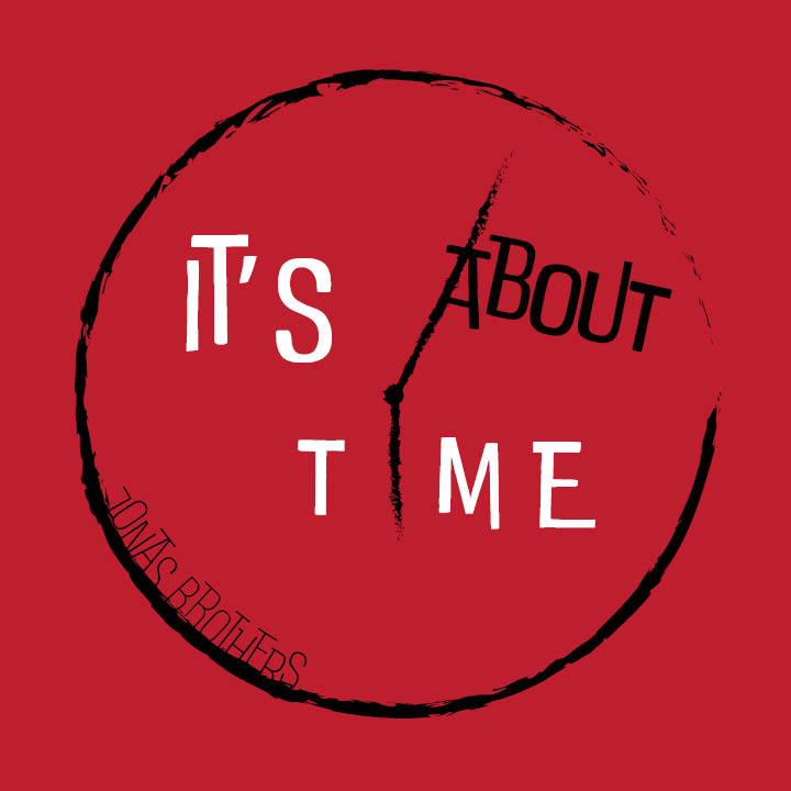
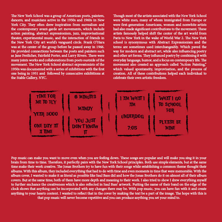
Doing this project was the epiphany of my career. This project was an album cover design using the style and techniques of a well-known artist and I chose Saul Bass. He took the meaning of something and broke it down into a simple concept. The band I did it on was the Jonas Brothers’ It’s About Time album. I like almost all their songs, especially X featuring Karol G. Since time is in the title, I literally made a clock in Adobe Illustrator with some contrast and the same color as their own album. I also incorporated the title into the clock’s hands. The back of album has zero’s because it is a countdown to enjoy some music! The text was done in Adobe InDesign because I had to download the Saul Bass font to match his personality. I did not know where to put the album’s song titles, so I put it inside the zeros, and it worked out perfectly. The text on the bottom and top of zero is how Saul Bass’ theories fit into this project. I honestly believe this is the best work I have done by far in my career.
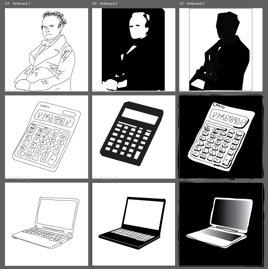
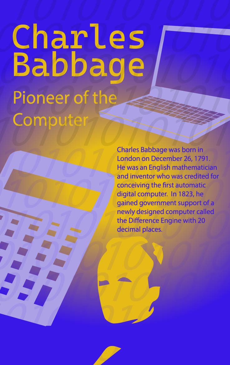
I created an informative poster based on a historical person. I chose Charles Babbage because he was the inventor of the first computer and to this current day, I am always on my laptop! I wanted to create something that was aesthetically pleasing to me. There were many parts and rough drafts to this project that were all done in Adobe Illustrator. The first step was to decide what images to use and how to use them. So, I chose a picture of him, a laptop, and a computer because those were the things that relate to him the most. Then I did three different styles of those pictures which were hand-drawn, silhouette, and dark contrast. I chose the silhouette of the three because I felt like they looked simple but unique at the same time. The second step was to do make two black and white posters as well as two different colored posters. I rearranged the text and images to give myself different options. Once I looked at the color palette, I immediately decided to go blue because that is my favorite color. But because I chose to do complementary colors, I had to incorporate yellow. I did not really like that combination, so I went to the color on the left and right, and I saw that purple and yellow look the best. The last step was to make any final touches. I added a radial gradient to make it look more interesting to the eyes. And finally added bunch of ones and zeros since computers run on algorithmic calculations. Overall, I would say I did a great job on my first project in my career.

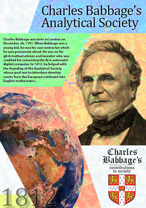
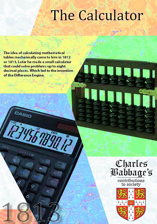
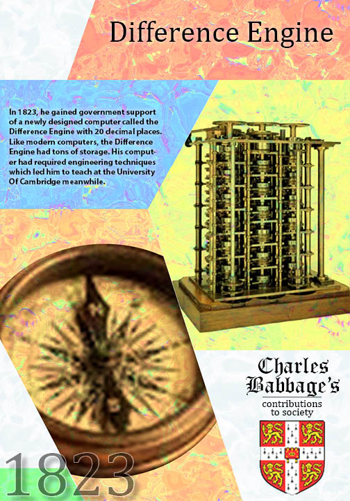
I used the same person from my informative poster project and expanded on that. I wanted the posters to be shown in a cohesive way. The pictures I had chosen were from important dates in his life. So, the pictures and color scheme were done in Adobe Photoshop. Since each of the posters had to have a different color scheme but at the same time look cohesive, I just rearranged five bright colors to allow the text to be seen. I also gave it a ripple texture in the background, so it does not look plain. Once I had the photos and color scheme complete, I integrated those posters to Adobe InDesign to write the text portion. This was a fun project to do especially with those colors!
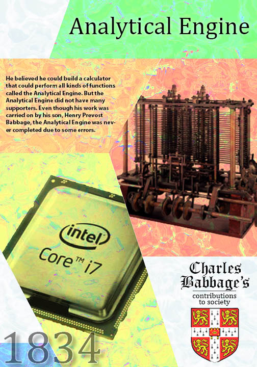
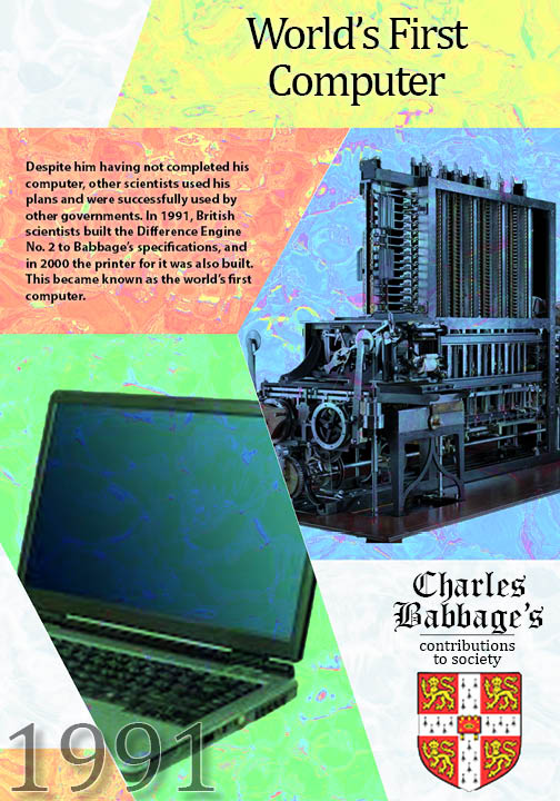
In this project, I simply wrote down the thought processes of the two Charles Babbage projects. The picture on the front is a better version of the silhouette that was done within Adobe Photoshop’s own tool where I took the picture, and it auto generated it for me. Everything else was done on Adobe InDesign. So, if you want to see me go in-depth on the two projects above, go ahead and click the link below!
Process Book PDF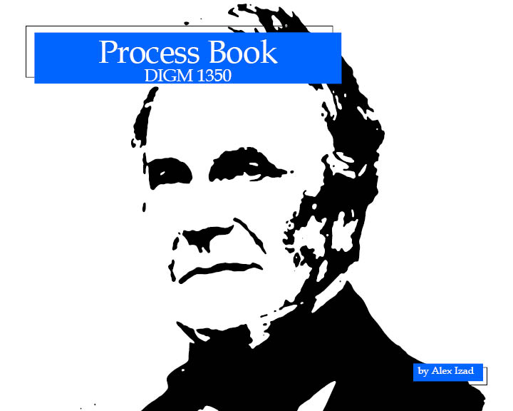
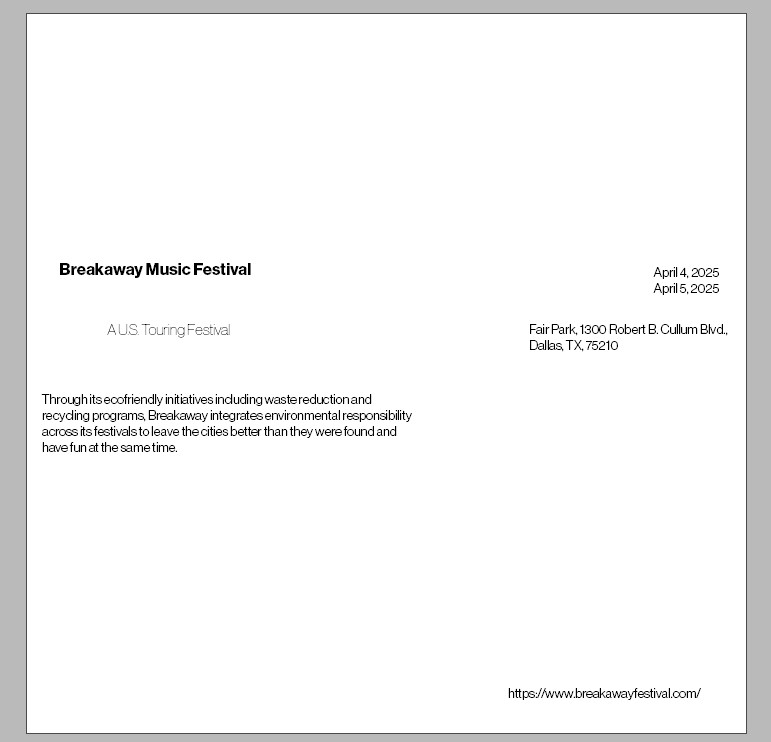
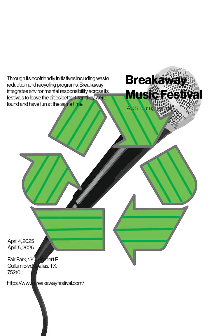
This is an event poster that I made based on the principles of typography. I chose to do the Breakaway Music Festival in hopes of creating an impressive poster for them! The rough draft of this project was simply applying the principles of typography with all the event details. There were many combinations of putting the text left aligned or right aligned, but I put just one of those here. The microphone was done in Adobe Photoshop the same way as the Charles Babbage silhouette in the process book. The reason there is a recycling symbol is because their festival was ecofriendly. They would do fundraisers for recycling trash by raising that money with this festival. Even though the text was already done in Photoshop, I still brought it to Adobe InDesign to see if Ican do anything different with the text. The final product looks great and even though there was nothing else I could do, but some parts of the text blend in with the background which is not ideal. It still looks great.
This was a project I thought I would never be doing based on the career I chose. I made a marketing campaign for a small business who is on social media. I chose to do a business called Sticky lollies. They make specialty candy that I like but cannot have them! I made a proposal letter outlining the projected costs and why I want to highlight their business on Microsoft Word. A low fidelity wireframe on Figma for what their website could look like. There is also a budget sheet on Microsoft Excel that goes deeper into the costs. The main part of this project is the strategy report. Everything was done on Adobe InDesign and even the cover came from InDesign itself. The colors for the text were taken from the cover. The top of each page after the cover shows a fruit roll up that gradually opens as you progress through the pages. This was done in Adobe Illustrator, and I thought that this way the pages would not look bland. Having something like this shows that I can do anything I set my mind to.
Strategy Report PDFBudget Excel SpreadsheetProposal Letter WordFigma Wirefram PNG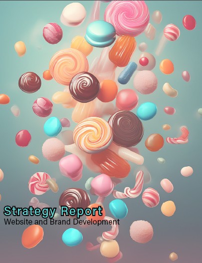
Want me to work for you? Please enter the information below. Here is my email if you have any questions: izadalex@gmail.com